Monday, 30 November 2009

HOW I CREATED MY WEBSITE

To begin creating a website, I needed a program to build my website on. There was a choice of three programs which enable the consumer to build a sucessful website for their small business. However, I encountered specific problems when using each of this websites.

The choices were:

Weebly - "Create a free website or blog in minutes by using a simple drag and drop interface. No ads. One of Time's 50 best websites of the year."

The disadvantages of using this site were:


- Text could not be easily moved
- Text boxes could not be created
- The set templates were too fancy
- The whole site was difficult to manoeuvre and understand


Microsoft Office Live - "Microsoft office live small business get a free website and more. It's fast and easy."

There were no strong disadvantages to this program, although there is no text wrap tool.

Google Sites - "Thinking of creating a website? Google Sites is a free and easy way to create and share webpages. ... New! Create a site from dozens of pre-built templates ..."

The disadvantages of using this site were:


- No text wrap
- Text could not be easily moved
- Text boxes could not be created
- The set templates were extremely basic and were difficult to edit
- The whole site was difficult to manoeuvre and understand


The website which I decided to use was microsoft Office Live as it had all the professional features I needed to create a newspaper based web page.
Firstly, I began by choosing my template and layout, as Microsoft provides a series of pre-made layouts for its users.

This is a screen shot of the pre-made layouts on Microsoft Office Live


After choosing my template, I began to insert one element after another just like the newspaper creation process, just to see how everything looked on the page.
As I believe everything to look visually pleasing in order to ensure the reader's interest, I chose to use my current html skills and adopt them into the webpage.
From previous experience in web design and photography, I used html codes such as scrolling text and hyperlinked images; I used scrolling text to broadcast the latest news (just like Harrogate Advertiser does) and used hyperlinks and navigation features to enable an easy and accessible web page experience.

I also inserted a search engine and a weather section, in order to inform the reader about local weather etc. The search engine is also evident on the Harrogate Advertiser's webpage, helping readers to search for what they desire.

I inserted the same masthead which I use for my newspaper into the webpage, however, I also added a pre-made background to support the greenery of Harrogate. Although no images can be seen in any of the webpage titles currently, I felt that I should challenge the conventions in order to present a visual display. Soon after, I started to insert all of my articles and images to support the newspaper. I also inserted a 'What's on' in Harrogate section and also a section where reader's have the chance to ask the editor direct questions.

GENERIC CONVENTIONS OF A WEBSITE

I researched into current web pages which advertise a certain newspaper.
Firslty, I decided it would be beneficial to look at The Harrogate Advertiser's web page and identify its conventions in order to understand a little bit more about how websites invite the buyer. Instead of analysing other ultralocal newspapers to the Harrogate area, I will also analyse a newspaper from a different local area, as most of these local newspaper are published by Ackrill Media group; therefore most of these local newspaper will have the same generic layout.

Here is a screen shot of the Harrogate Advertiser's web page.


The conventions I have identified are as follows:


- Organised layout
- Bold title (however, the title is not substantially large which is interesting, as the masthead on the Harrogate Advertiser's newspaper is noticeably big)
- Hyperlinks and navigation bar
- Search engine
- References to jobstoday and property today etc
- Date
- Updates in a scrolling marquee
- Advertisements
- Subheadings, headings and images
- Letters to the editor
- 'What's on' column


What cohesive links does the Harrogate Advertiser's web page have with the newspaper itself?


- Similar/same articles
- Brand identity and house style
- Date and time
- Advertisements
- Some form of navigation
- Same images


What differences does the web page and the newspaper have?


- Hyperlinks and search engines on the web page
- Small proportion of articles with a link to the full article on web page
- Comment options on the web page
- Web page has scrolling text and other visual aspects which the newspaper does not have


This variation of similarities and differences outline the divergence between the hard print copy of the newspaper and the interactive, modern and 'instantaneous' version of the newspaper in web pages.
New media, for example, the internet has been involved in the decline in profits of print media.

I have also researched on the internet into the common generic features of web pages. One website, Jerz Setonhill.com, states that there are five key factors you must follow to create a conventional and successful newspaper based web page:


- Lead with your best stuff: put your best stuff at the top of the page to keep readers engaged and entertained
- Inform with meaningful links: to provide meaningful information to the reader
- Employ consistent navigation: 'Home' link in the navigation bar and other consistent links
- Prefer simple designs: to avoid confusion and to get straight to the point
- Write scannable text: provide meaningful subheadings, bulleted lists and bold keywords


What about The Hereford Times?

Here is a screen shot of the Hereford Times' web page


Is there any relation between this web page and the Harrogate Advertiser's web page?


- Noticeably different layout
- Hereford has larger title
- Both have main web page conventions such as navigation, images and text

FEEDBACK OF SECOND PAGE

After creating the second page of my newspaper, I wanted to gather a series of audience feedback in order to improve on my piece; the constructive criticism given could possibly help me to create a better piece overall, just like I did with my front page.

Below is a list of feedback I gathered:


Friends:
- "I love the advert and the other images on this page"
- "There are so many articles and I think this page is very conventional"
- "The advertisment towards the bottom right hand corner of the page is really good. I also think that the quality of the rest of the images is brilliant"
Teachers:
- "the Index towards the top of the page needs to be bigger"
- "I really like this page. It seems stronger than your first page at the moment. You need to get your images sorted altogether and the piece will be sucessful"

There is no significant changes I need to make to this page, however, I need to make the font of the Index section bigger and possibly add another image to the Driving Ban article.

CREATION OF SECOND PAGE

The screen shots featured illustrate the drafting process of my second page:


This screen shot shows the basic layout of my second page. I have added text boxes on Microsoft Publisher to create this layout. I believe that by adding specific elements to the page gradually, it helps to create an organised and planned structure.


This again shows the process of adding elements to my page for an organised structure. I have begun adding images as well as text, so that I can see how everything looks on the page. In my opinion, this is the easiest process when creating a media product such as this, as planning is key.


This is a screen shot of the middle part of my second newspaper page. I have added in all articles and images I need besides from the image for the 'HUB' article. This is again, a planning process to see how everything looks on the page.


Here is a screen shot of the bottom of the second page. I have continued to insert articles into the page as well as images. A variation of the articles originate from the articles I previously wrote in the blog. I have also written a few fillers to also insert into the second page.


Here, I have decided on my final main article on the second page, and inserted an image. I have also left space for the article itself.


This is almost the final product as I have inserted all of my articles I am completely happy with the layout. There are a few images I need to fulfill completion, as well as an advertisement. I may advertise a clothing line in the Harrogate area or even a florists to support the greenery of Harrogate.


This is the advertisement I made for my second page; it involves an image I took of my friend in cotemporary clothes to market a contemporary clothing line in Harrogate, Laudanam. I really like this advertisement as I believe it to be quite powerful; the use of black makes it stand out and the image is of a high quality.


MY FINAL PIECE

Wednesday, 4 November 2009

AUDIENCE FEEDBACK - 1ST PAGE

After creating the first page of my newspaper, I wanted to gather a series of audience feedback in order to improve on my piece; the constructive criticism given could possibly help me to create a better piece overall.

Below is a list of feedback I gathered:


Friends:
- "I really like the layout and it looks really neat. Some of the images aren't of a good quality though"
- "I like the use of green and I like the photography in the advertisement but the other images aren't as good"
Teachers:
- "Most of the images contain props or places as opposed to people. There needs to be images which contain the people of Harrogate"
- "There needs to be less images of shop fronts. One is enough"
- "The font should be bigger on the headlines as this can be seen in most newspapers"
- "I love the colour scheme and how it you've made a conventional house style. Everything is good apart from a few images and possibly the advertisement"


I also thought about the changes I could undergo in order for my front page to be a lot more successful:

- Images: these to need to be of a lot better quality, as most were taken from a mobile device. I also need to vary my angle of each image, as most on the front page are medium shots, therefore I need to take images of close ups and long distance shots. People need to be included in most of the images also in order for the newspaper to seem ultralocal. Possibly a photograph of the headteacher at Harrogate Grammar School would be good for the main article.
- Advertisement: this needs to be far more interesting than a photography based advert. Possibly an advertisement of a flower shop could be put here in order to compliment the greenery of Harrogate and its well known flower shows.
- Headlines these needs to bigger in order for the reader to be able to identify the article quickly.


Here are a few changes I made to my final piece which originated from my feedback:

- I have taken a photograph of the Head Teacher of Harrogate Grammar to support my main article; the previous image which can be seen on my drafted piece came from the internet as it was not my own. I have gone for a close up shot of Mr Sheriff (the headteacher) in order to vary my angles in each image.
- I have inserted images of a group of girls in order to support the article of Jakes restuarant and the Bar Crawl. I wanted more images of people in my newspaper as opposed to shop fronts that lack human perspective.

Here is a screen shot of the overall product:

PHOTOS & MANIPULATION

Most photographs shown on the front page of my newspaper have been taken from a mobile device. The main image is not my own, as this is temporary; I wish to take an image of the headteacher of Harrogate Grammar to support the article.

Using a mobile decreases the quality in the images, so I may need to use an SLR camera if I wish to replace my current images.

First I had to pick my images from a collection of shots, and then edit that final image. For example, for the article about Jakes restuarant, I had to pick from a variation of images of customers in Jakes restuarant:


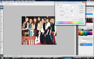
I then edited the image in photoshop using a range of tools.


Here, I have used the Saturation and Hue tool to make the image a little more believable in terms of colour, as the image turned out to be quite bright as it was captured on an average digital camera.

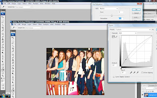
Here, I have demonstrated the use of contrast and brightness.

I continued to edit all of my images as previously shown. Photoshop CS4 is a brilliant program to use for editing images and is used for professional photographs.

Monday, 2 November 2009

CREATION OF FRONT PAGE

The screen shots featured illustrate the drafting process when beginning to create my front page:

Here is a screen shot of the first stage of my newspaper front page. I began placing text boxes on the page to get an idea of the initial layout. The text box tool can be seen in the tool bar from Microsoft Word and is an easy application to use. After this stage, I then began to figure out where all of my news stories could potentially go, so I inserted the titles from each of my stories into the text boxes. I have also began to maintain a sufficient house style as I have used the colour green throughout the front page; I felt that the colour green could also compliment the greenery of Harrogate, and the well known Harrogate Flower shows.


This stage of my front page contains the following newspaper conventions so far:

- Cover lines
- Header
- Large Masthead
- Colour - house style
- Puns (e.g. Adjudicator "RULES" Admissions Unfair and The "MOUNT" On Cheltenham)
- Borders
- References to page numbers (e.g. "see page...")
- Large font for main article and masthead


Here is the second stage of drafting my newspaper front page. I began to insert my newspaper articles as well as understand where my images initially need to be. This process helps, as you can see visually whether certain articles fit into the text boxes or whether the layout must be changed. All of the articles included in my newspaper can be viewed in the previous blog: articles.


This stage of my front page contains other newspaper conventions so far, such as:

- Articles which include typical newspaper language (which will be dicussed further on in the blog
- Inserted an "online" column


This screen shot shows a more complteted stage of the newspaper; where I have inserted my news stories and began inserting the images to support the text. I have also included an "online" section which appears to be conventional in all ultralocal newspapers. By doing this, the buyer can then refer to the online page if they cannot access the paper itself. I have also inserted a picture box for where my advertisements will go, and a barcode which lies beneath a "recycled newspaper" logo. All ultralocal newspaper also include this recycling logo, in order to try and help the environment in saving paper resources. The grey text boxes to the left of the barcode include two other newspaper stories based on crime. These are grey, as they are added fillers which are also evident in other newspapers.

This stage of my front page contains the added newspaper conventions so far:

- Grey texts boxes for fillers
- Images to support text
- Barcode
- Recyling logo
- Space for advertisements


Here, I have inserted cover lines into the header of the newspaper, and I have also supported these with images. In my opinion, the images shown here are weak, and so are temporary, as I need to experiment with my photography a little more (for more information, see the next post: manipulation of images. i have also inserted a ....... which includes the price, website and date of the newspaper. I have done the following as these are typical newspaper conventions, and even the thicker border around the main article mirrors typical ultralocal newspaper conventions. Visually, the images and possibly the layout itself could be tweaked, but I would like some audience feedback on the final piece before re-doing certain aspects of the front page.


This screen shot shows the column to the right of my newspaper. It includes a section featuring key stories which are included inside the newspaper. All three images were taken from a mobile device, however, the poor quality weakens the overall effect. These smaller images need to be redone with a mega pixel camera in order to give the newspaper a professional look. Below these images, I have included page references and captions so that the audience is aware of what's happening and what the images are about.
Again, the borders around the main article can be seen here which is a main convention in ultralocal newspapers.

This screen shot involves my advertisement. I have used an original photograph taken from my photograph course to support the greenery of Harrogate. Although the advert itself markets a photography based campaign, the actual image itself is captured in Harrogate and compliments the consistent green influence in my newspaper.


Here is a screen shot of my final piece. I now need to gather a series of audience feedback in order to improve on anything which could influence the sale of the newspaper.